
April 2026 Topic of The Month: Recap Roundup
From neighborhood storefronts to large-scale commercial sites, this 6-month recap brings together some recent projects, including exterior signs, interior graphics, and everything in between, each shaped by the space it lives in and the people it’s built for.
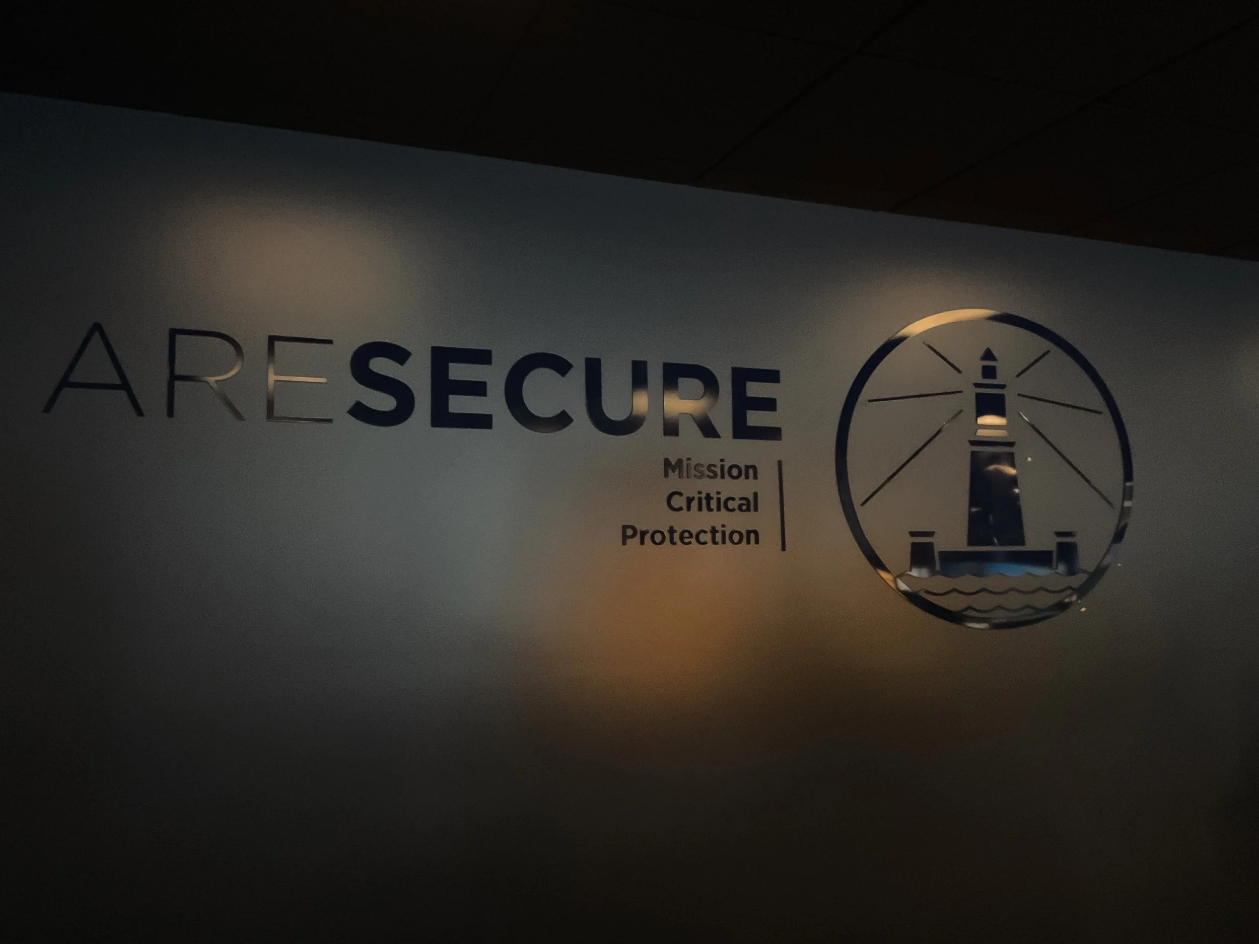
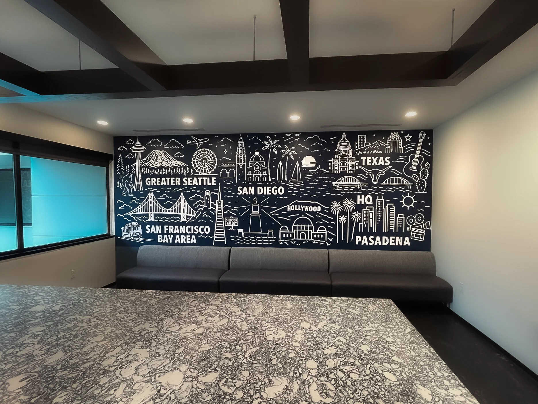
Alexandria Real Estate Equities – Bothell HQ Security
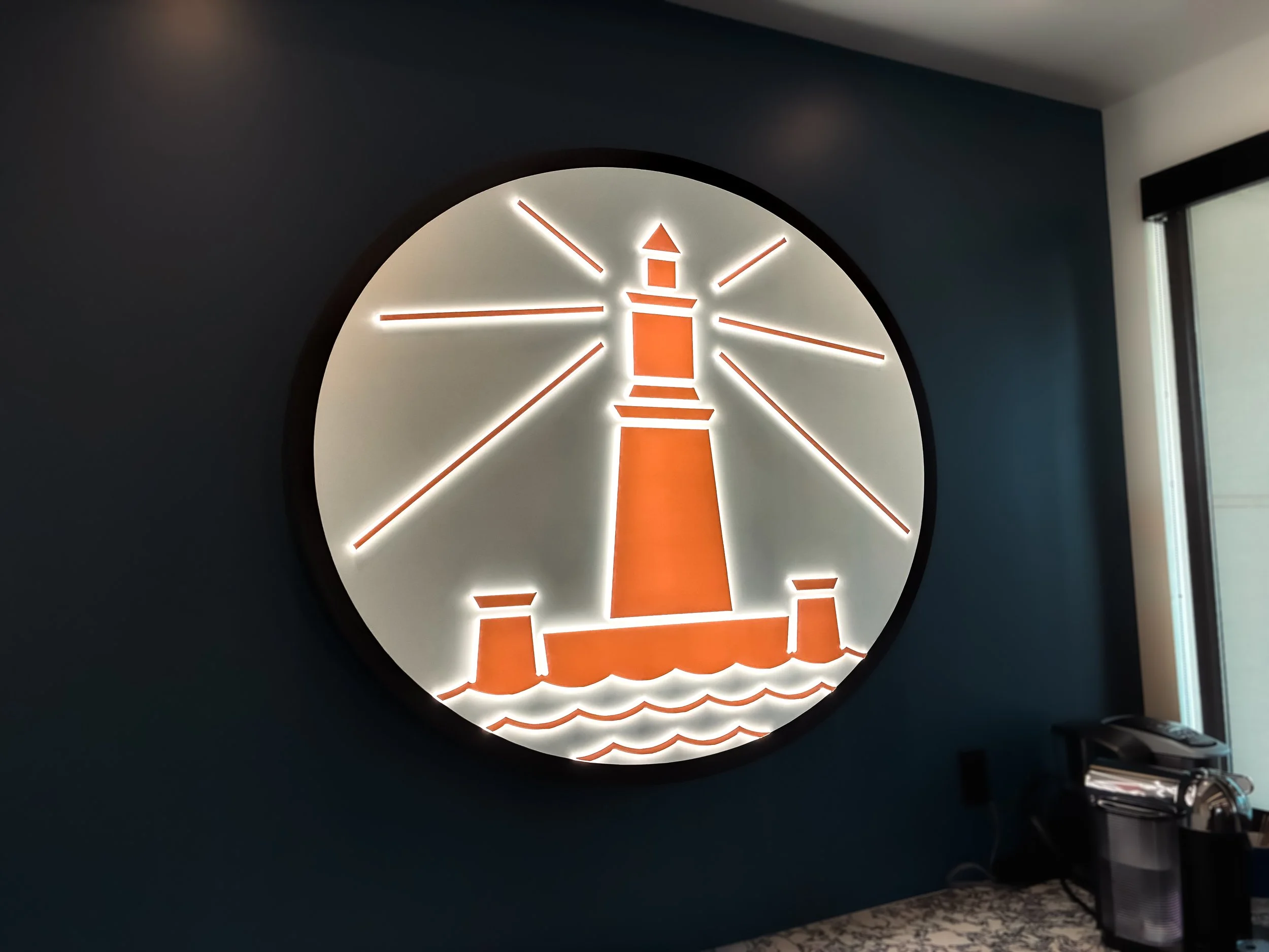
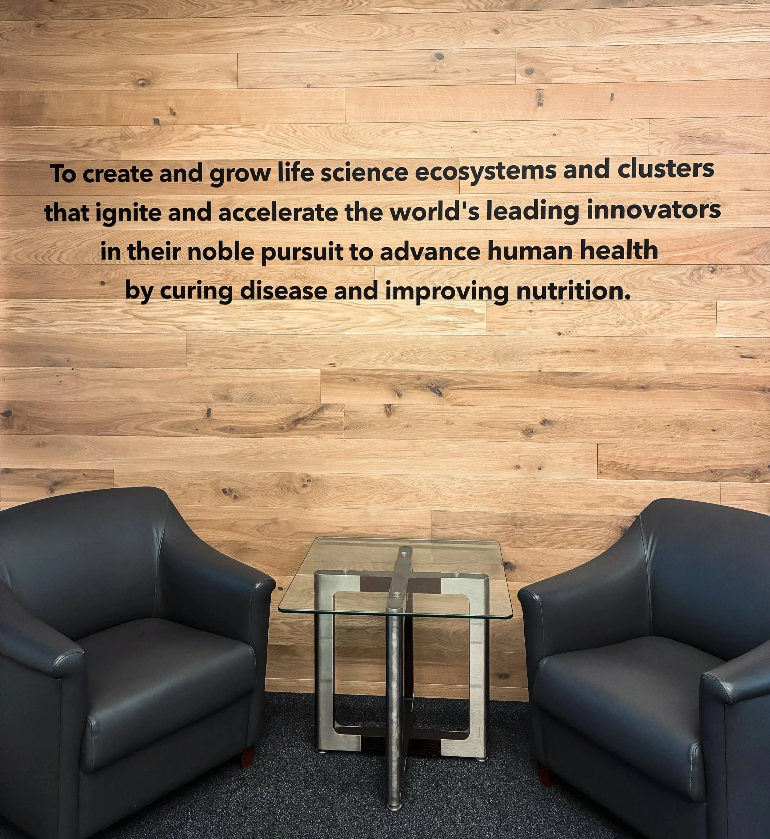
At Alexandria Real Estate Equities’ Bothell headquarters, the project focused on creating a cohesive brand through their security entry sequence.
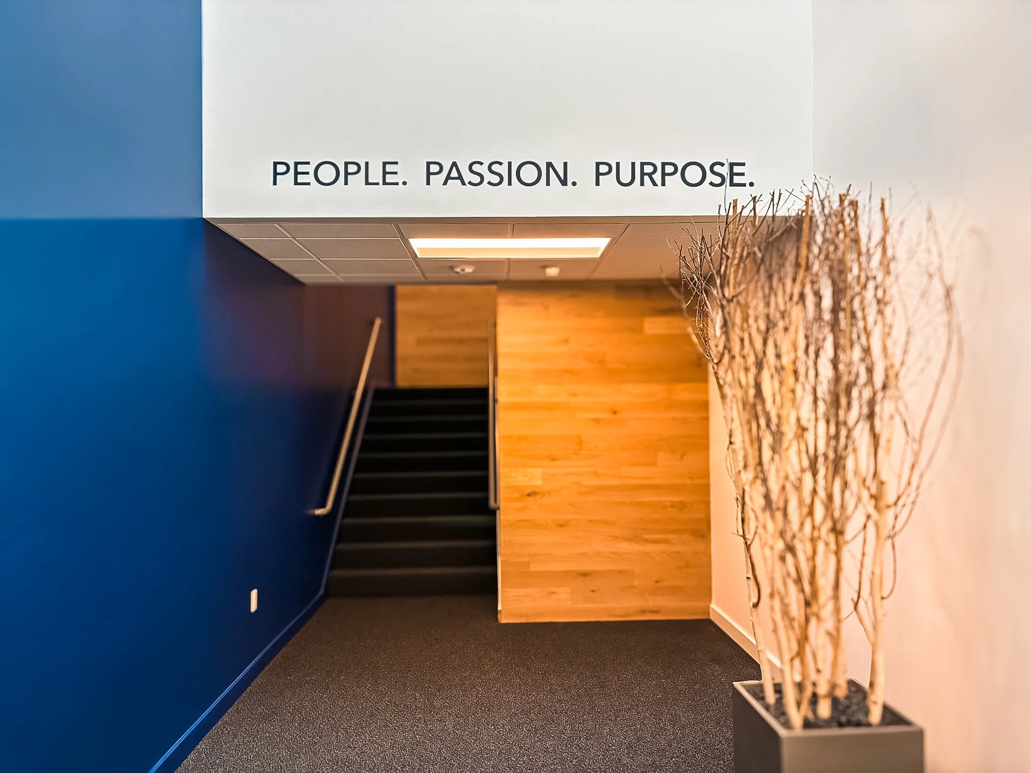
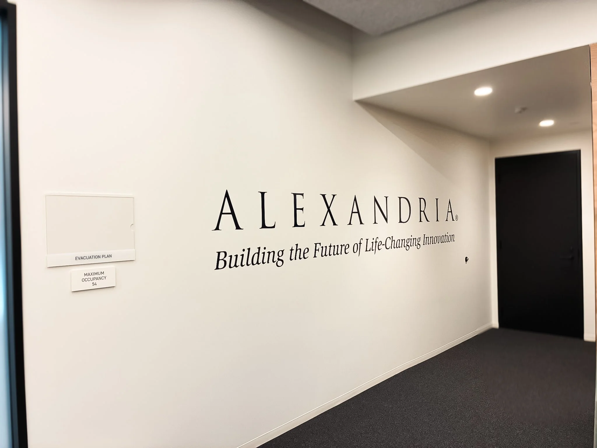
The scope included exterior and interior vinyl door graphics, a non-illuminated flat-cut acrylic logo, and a feature illuminated wall sign with push-through graphics and warm LED backlighting. Inside, mission and value statements in acrylic and vinyl are paired with a large-format wallcovering highlighting key Alexandria markets.
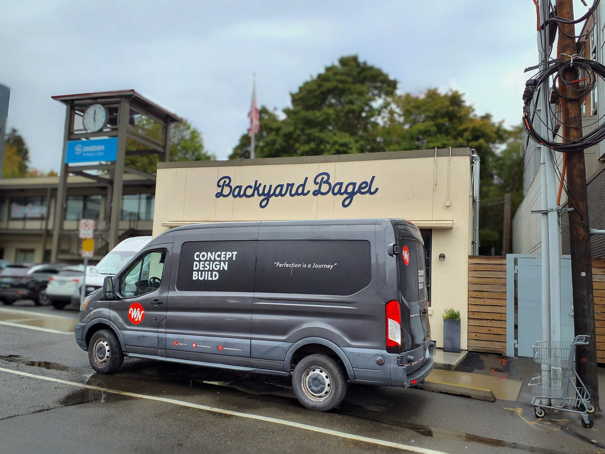
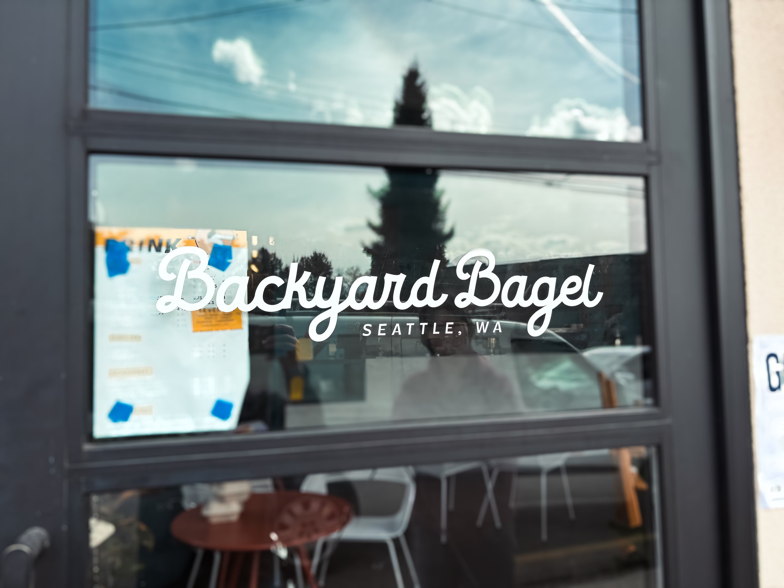
Backyard Bagel – Union Bay
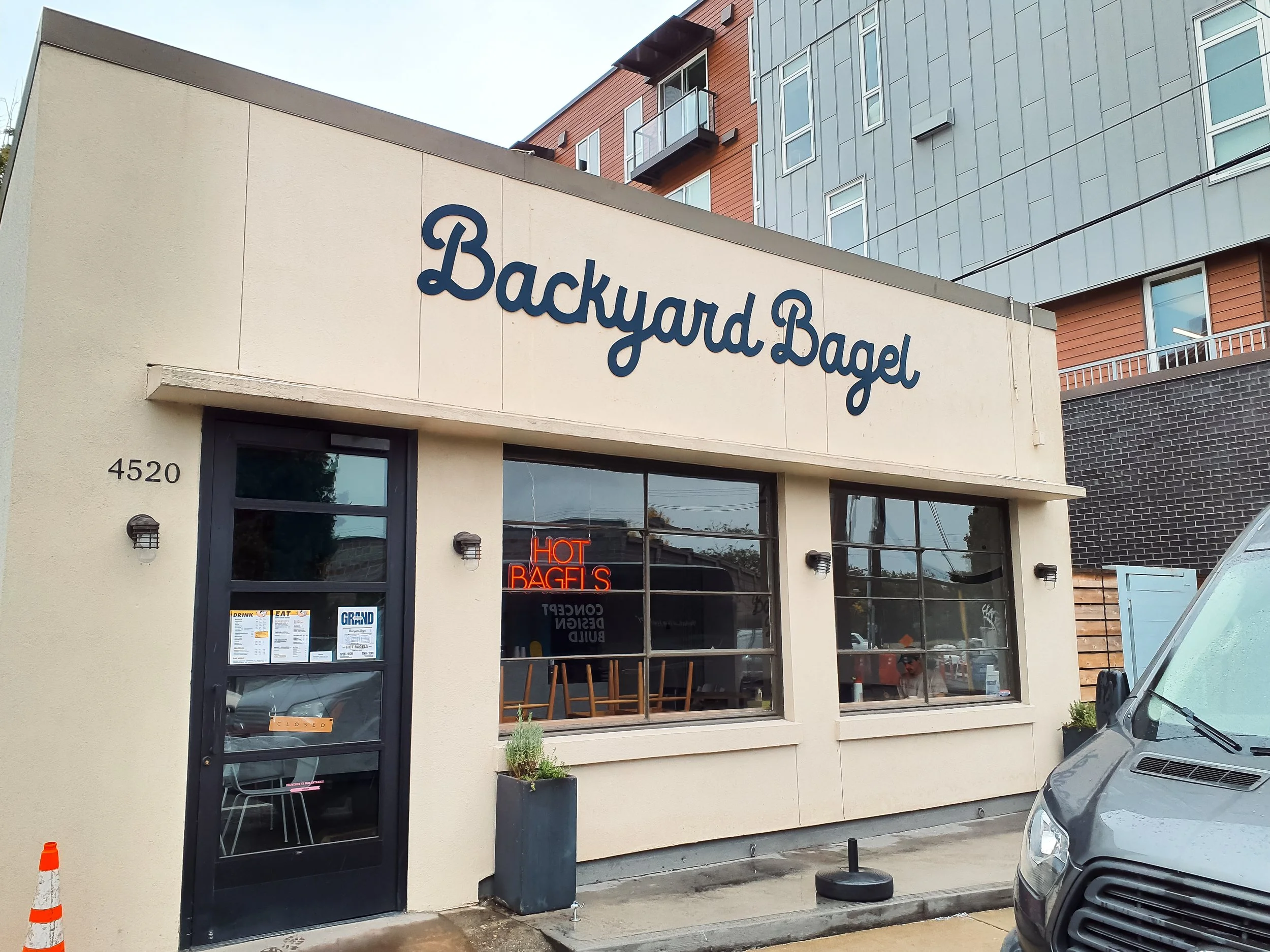
Backyard Bagel is a neighborhood shop rooted in small-batch production and an easygoing local atmosphere, reflected directly in its signage.
A 15’ × 3’ non-illuminated wall sign anchors the façade, featuring cursive-style lettering in ¼” flat-cut aluminum with a dark blue satin finish. The script introduces a relaxed, handcrafted feel while still reading clearly from a distance. White vinyl on the entry door glass carries that look through the storefront.
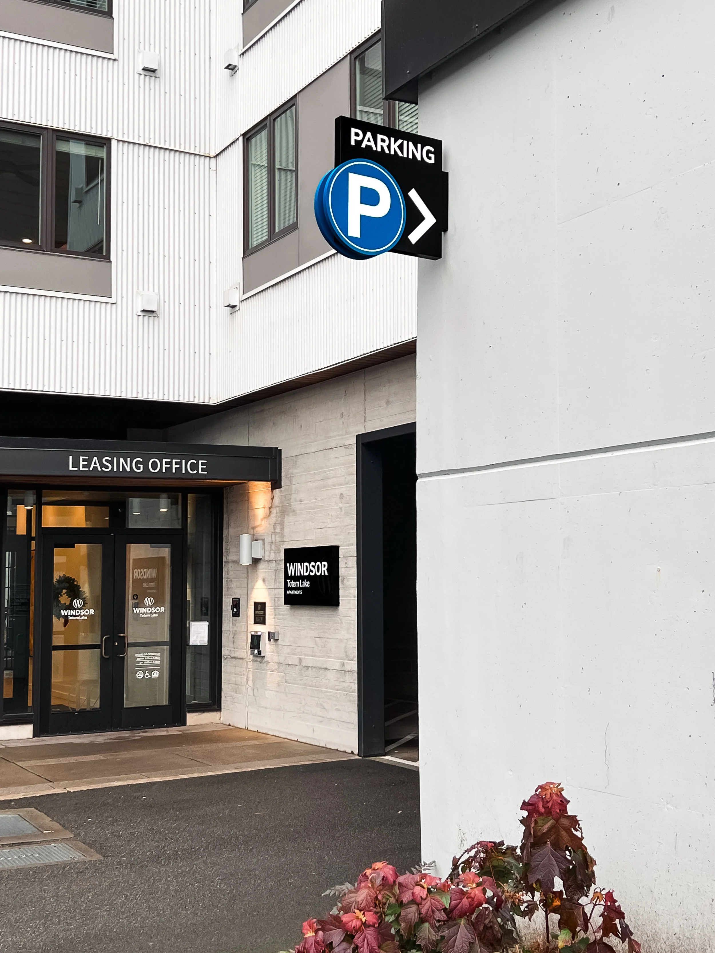
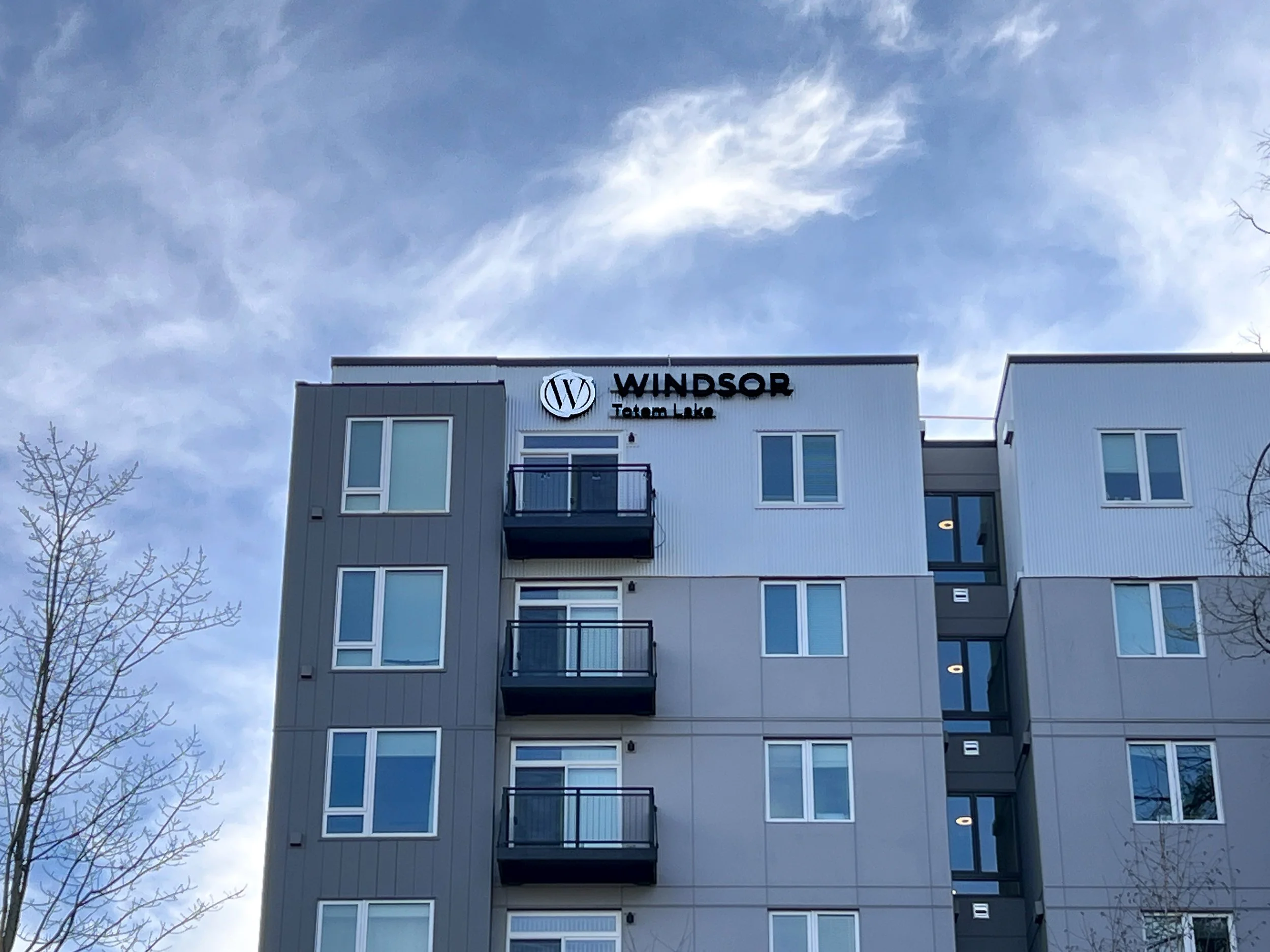
Benson Signs – Windsor Totem Lake
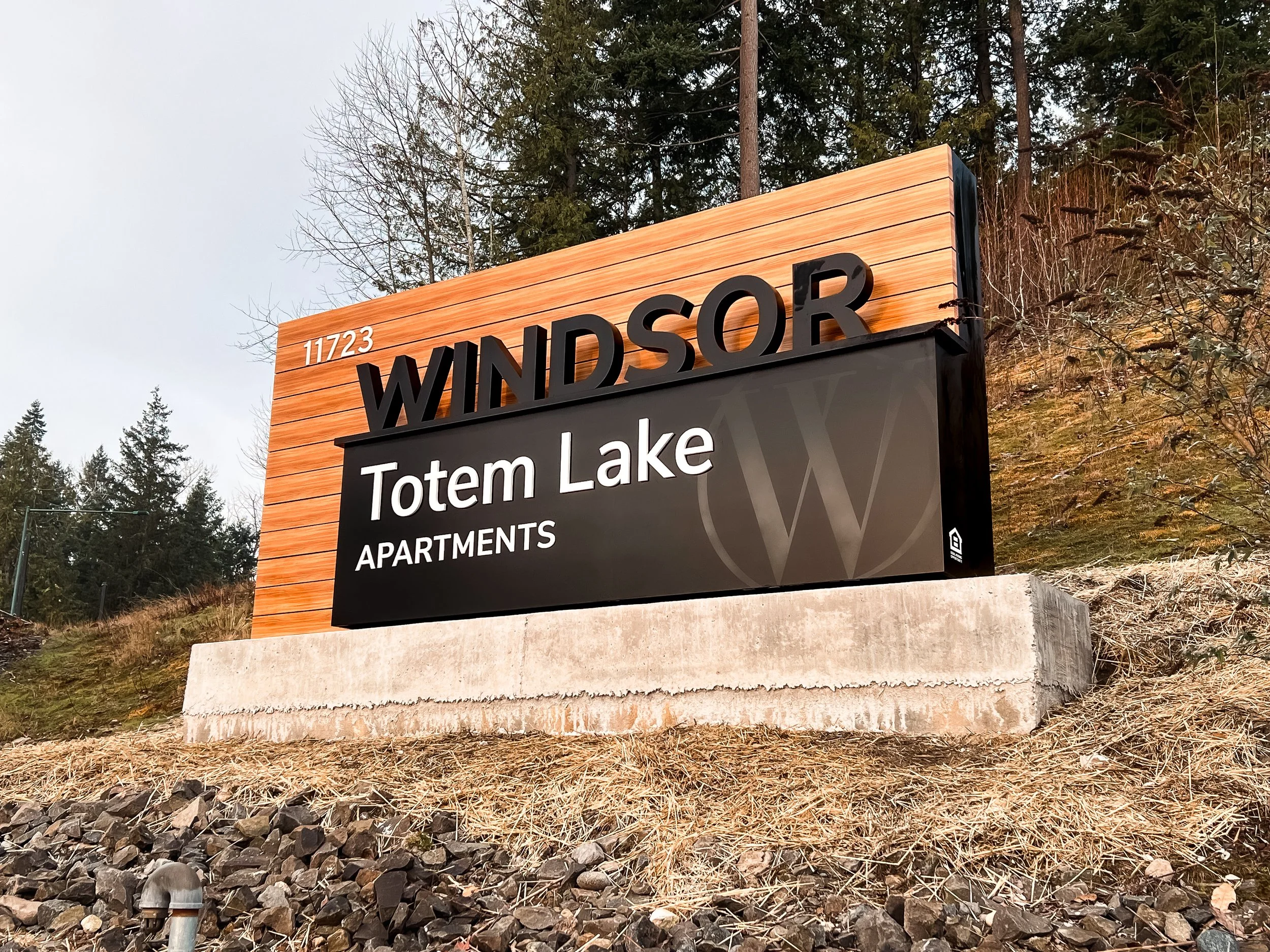
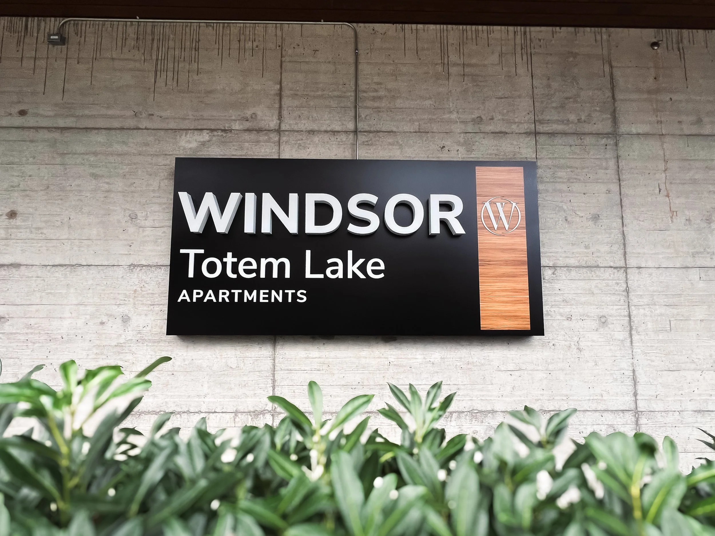
For Benson Signs at the Windsor Totem Lake Apartments, the signage package creates a unified system across wayfinding, branding, and entry points.
Key features include illuminated channel letters with a fabricated cabinet and integrated LED lighting, layered with acrylic components, and printed wood-texture detailing. Additional installations include a raceway-mounted illuminated channel letter set, a smaller illuminated wall sign for directional use, and a double-sided blade sign for parking.
A large non-illuminated monument anchors the street corner, combining aluminum construction, dimensional lettering, and wood-texture accents to support the architectural language. Together, the elements maintain strong visibility and material consistency across the site.
Bothell Pet Hospital
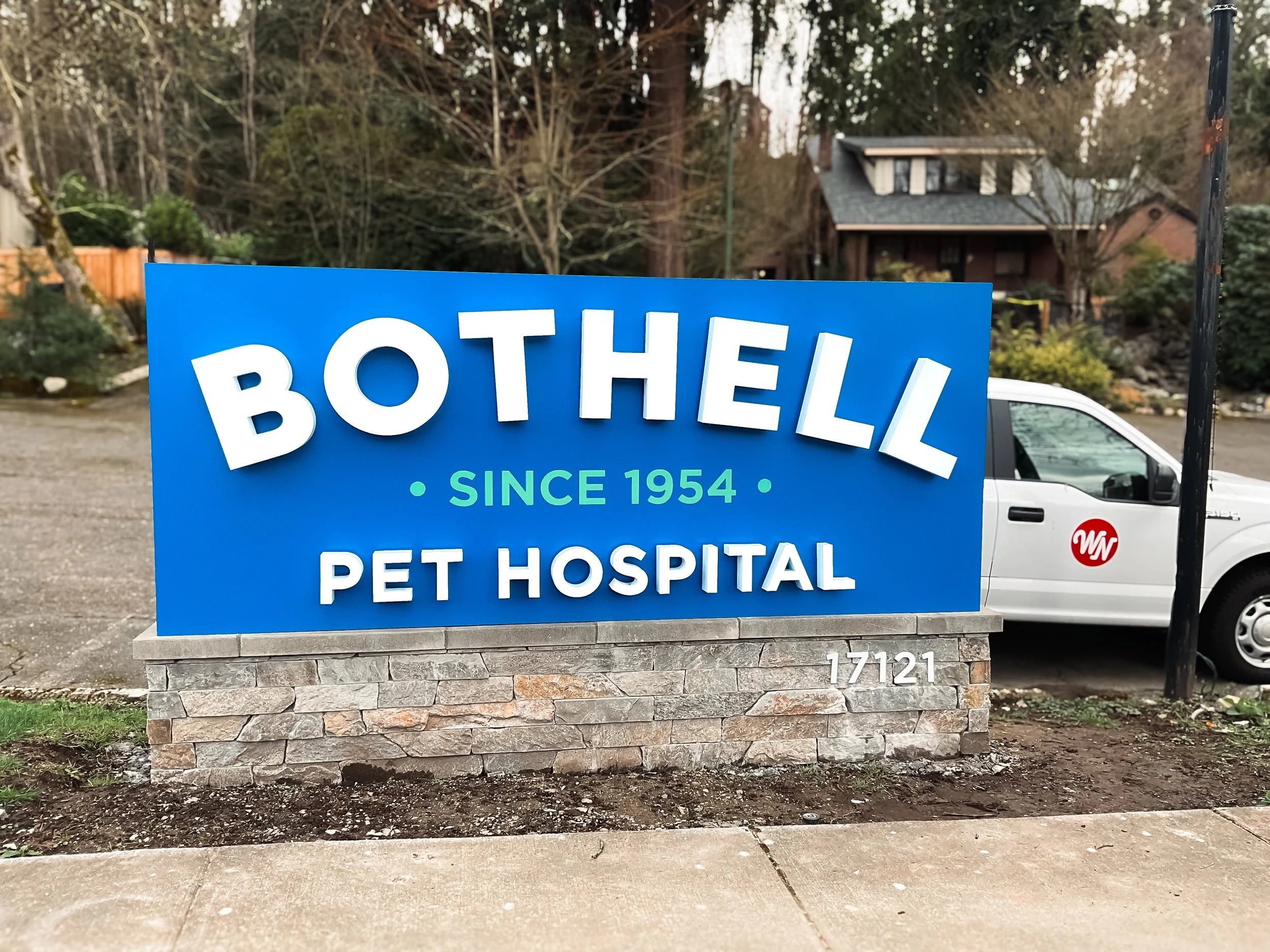
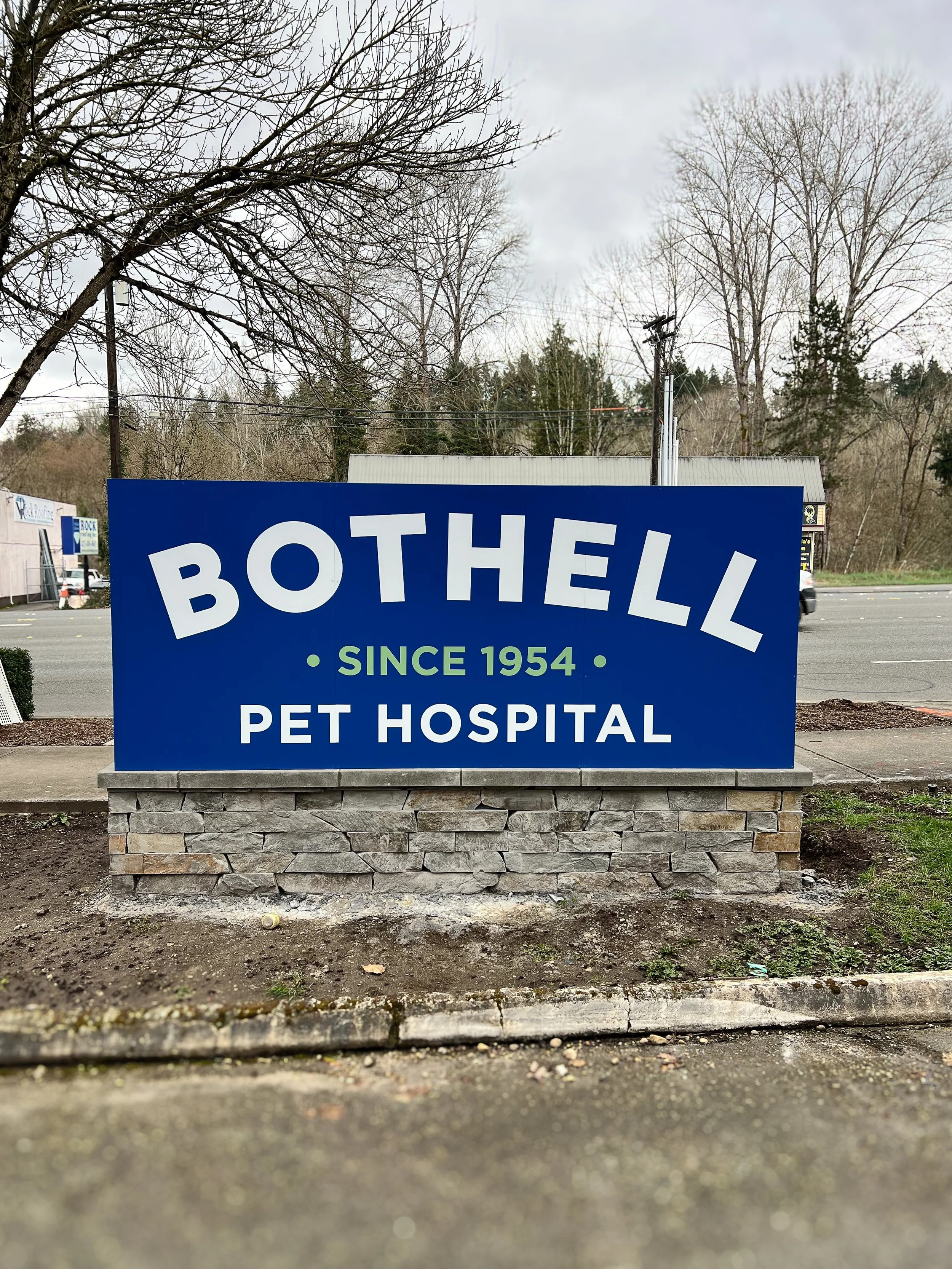
Bothell Pet Hospital, serving the community for over 60 years, needed a roadside monument that communicates both professionalism and approachability.
A 11’ × 4.5’ fabricated aluminum sign body in satin blue forms the structure. The face features halo-lit dimensional lettering in satin white for nighttime visibility with a soft glow. “Since 1954” is incorporated using routed aluminum with translucent acrylic and printed vinyl accents.
The reverse side carries a non-illuminated version of the graphics for dual visibility. A ledger stone veneer base and flat-cut aluminum address plaque complete the installation.
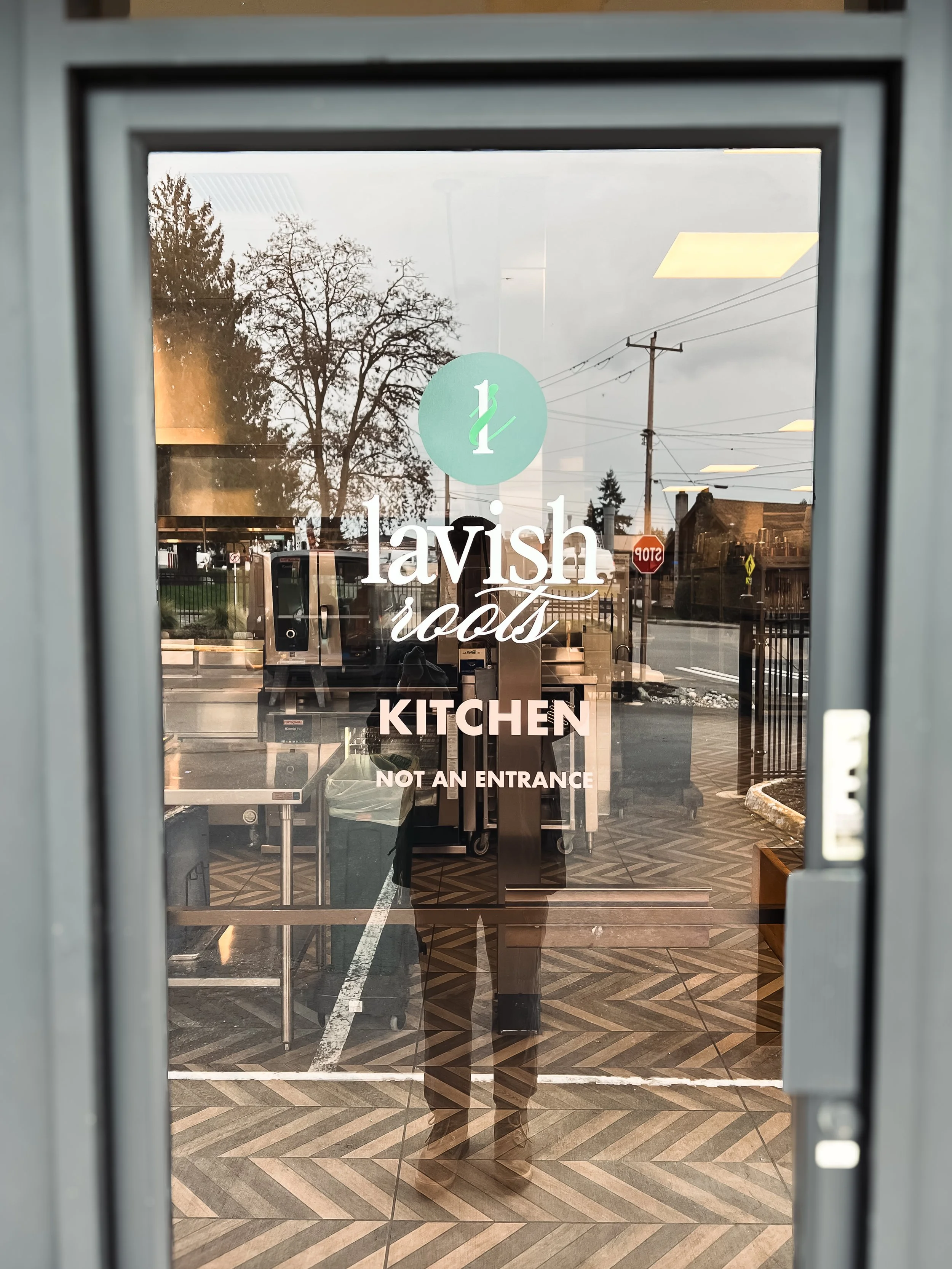
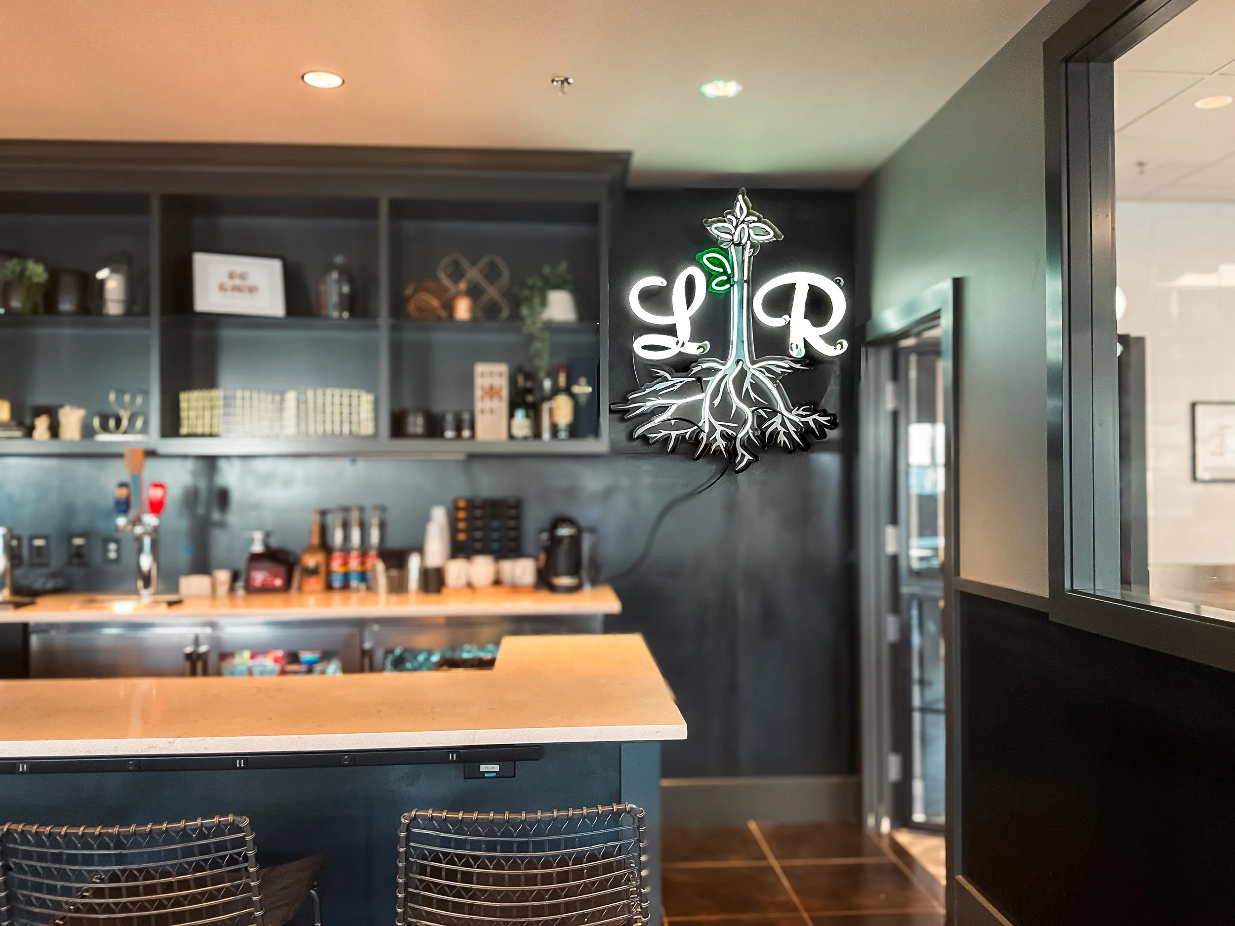
Lavish Roots Catering & Hospitality
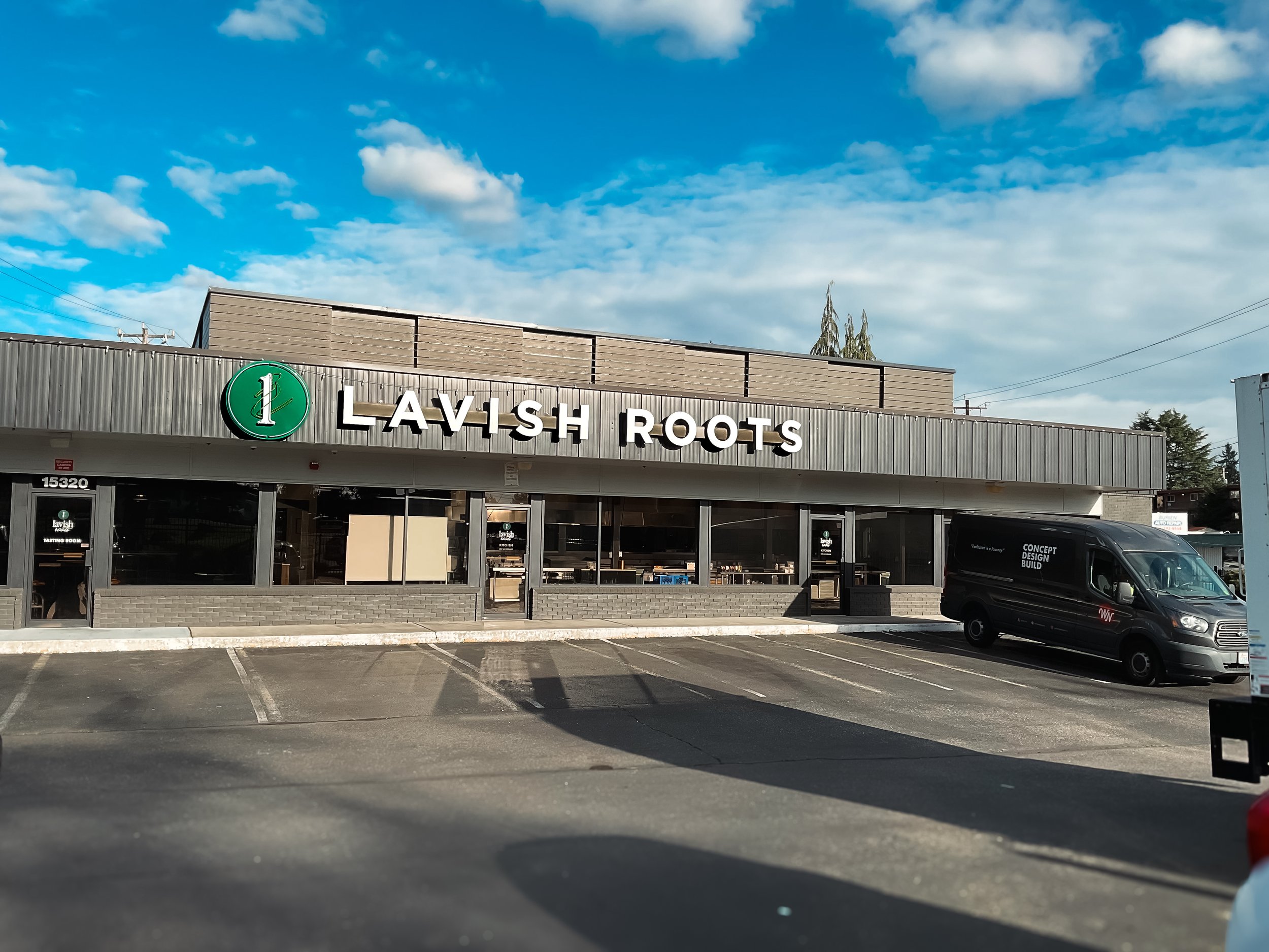
Lavish Roots Catering is a Seattle-based company recognized for seasonal, chef-driven menus and refined event presentation.
Five exterior entry doors were updated with branded vinyl graphics using digitally printed artwork with matte UV laminate and white vinyl lettering to ensure consistency across multiple access points.
An existing illuminated wall sign was refurbished and repurposed for interior use. The raceway was shortened and power converted to plug-in. Original aluminum channel letters were retained, preserving the dimensional “Lavish” branding with acrylic faces and translucent vinyl detailing.
MBellish Studio
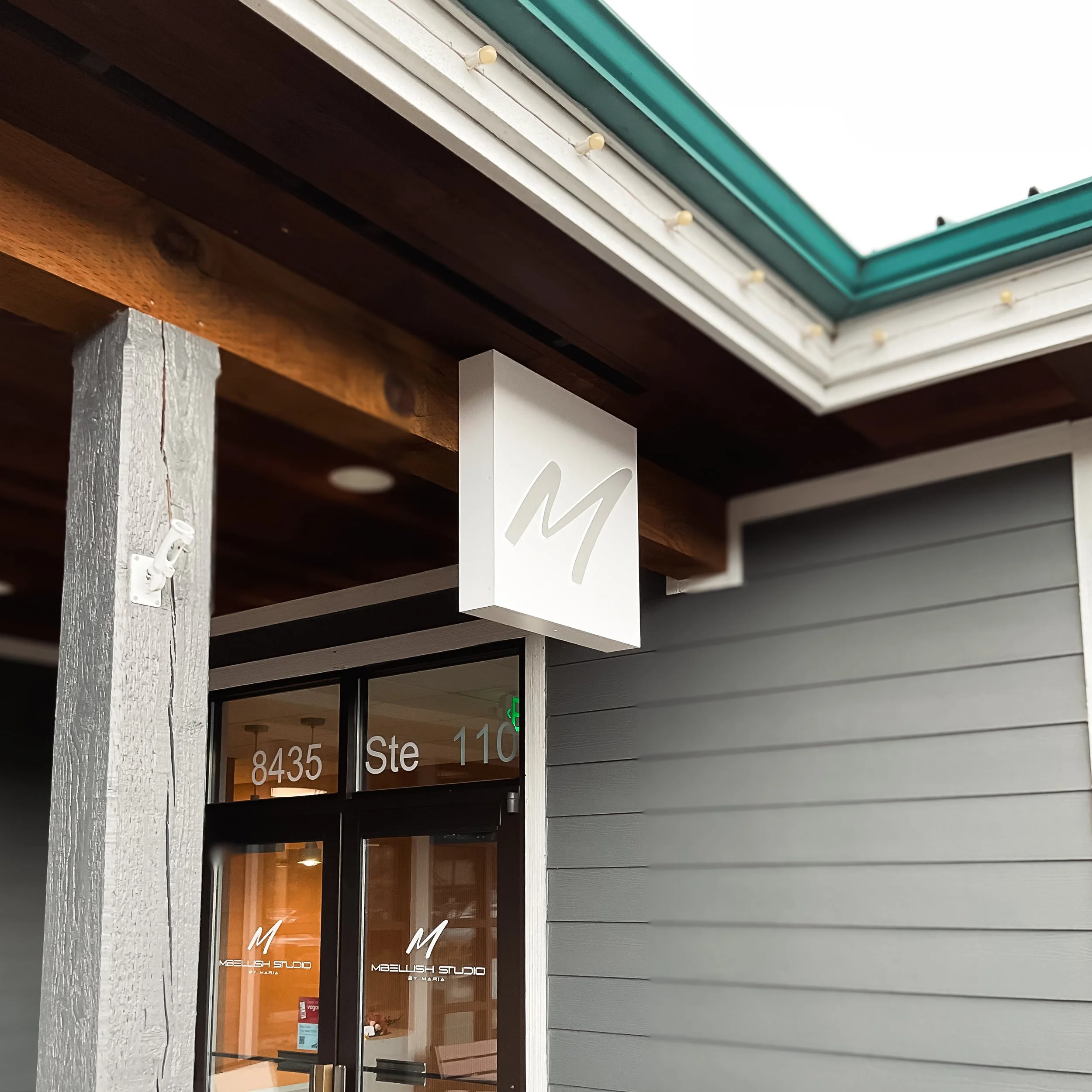
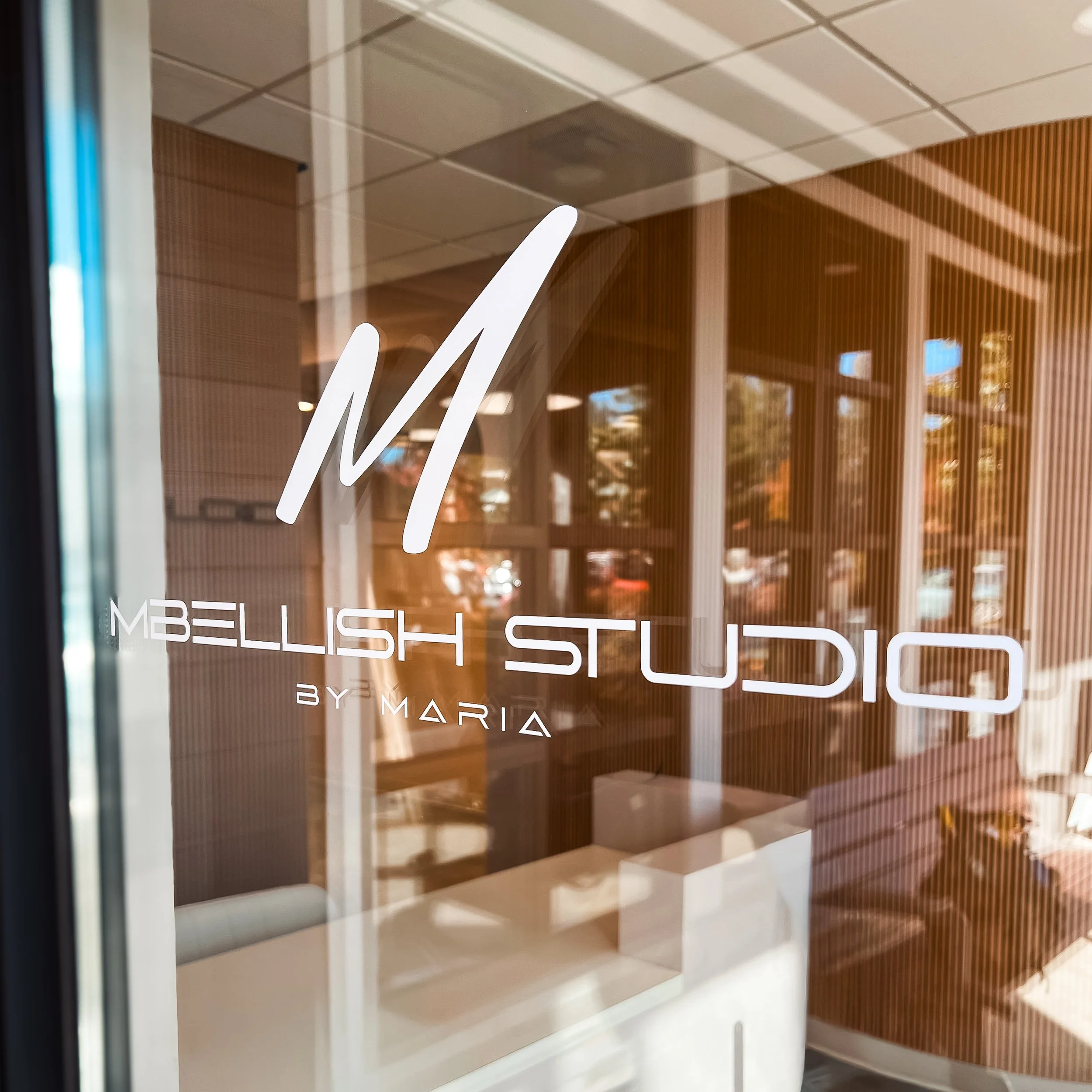
Mbellish Studio is a boutique beauty and aesthetics studio focused on personalized services within a modern, design-forward space.
A 24” × 24” fabricated aluminum cabinet serves as the primary exterior sign, finished in white with internal illumination for soft visibility. Push-through acrylic adds subtle dimensionality. White vinyl on the entry door glass reinforces the branding at street level without introducing visual clutter. The package supports a restrained, polished storefront aligned with the studio’s aesthetic.
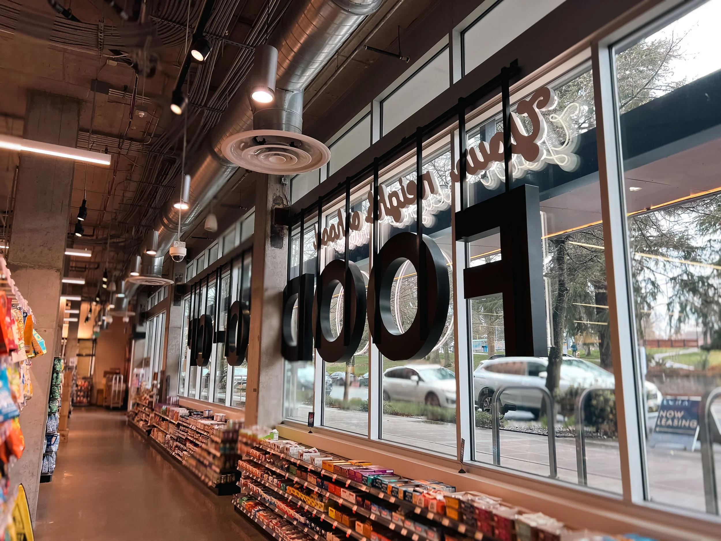
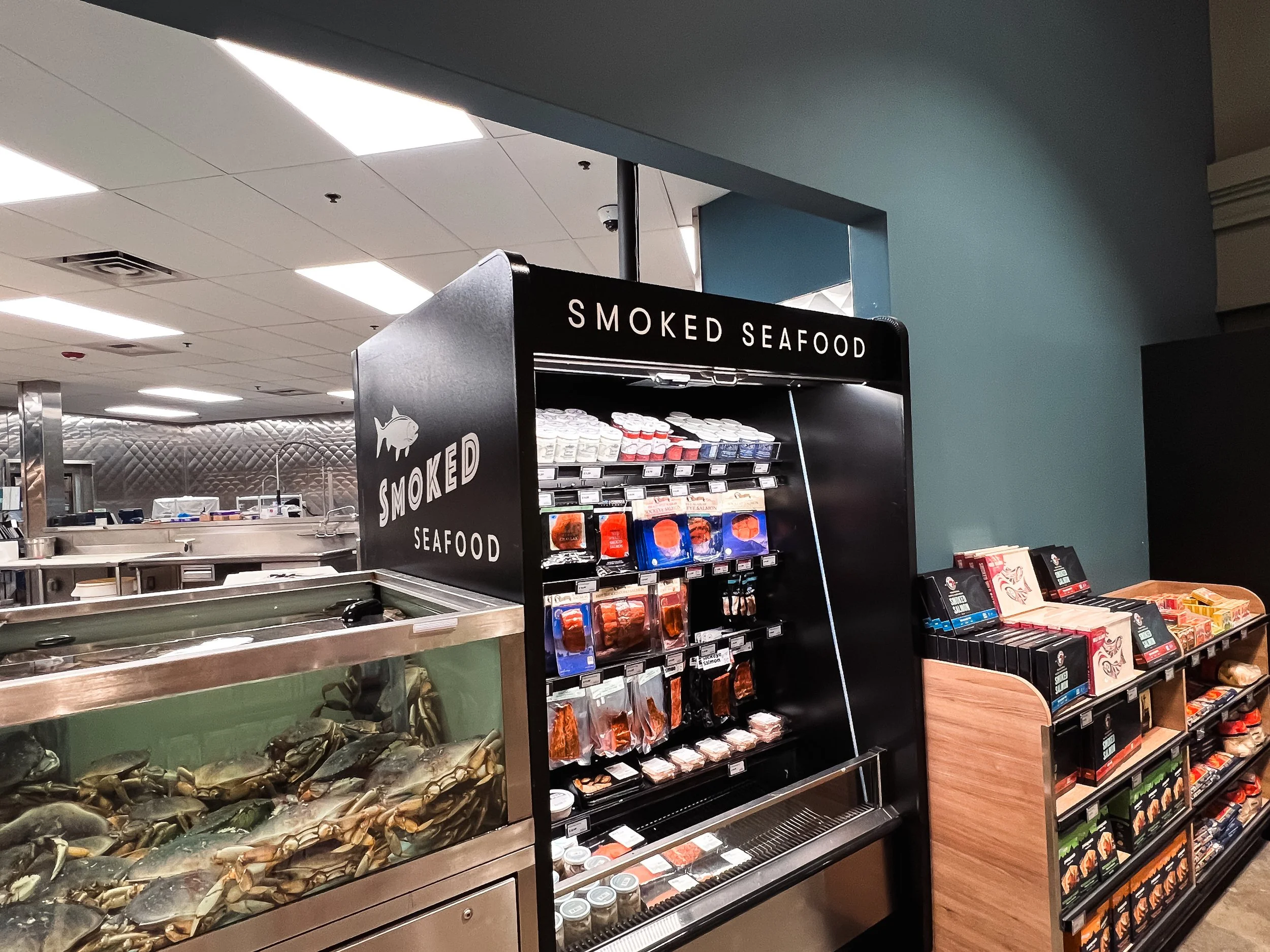
PCC Community Markets – West Seattle
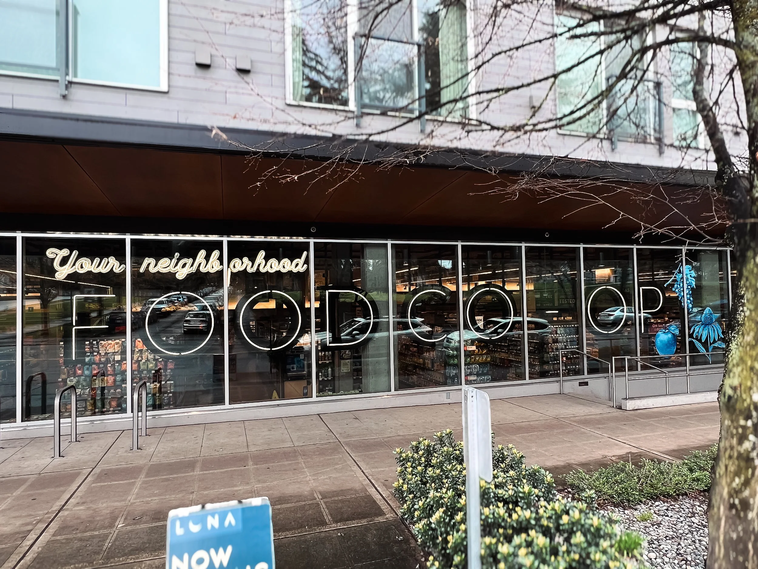
At PCC Community Markets’ West Seattle location, the installation introduces a large-scale interior feature that doubles as signage.
A 40-foot interior neon system is built from fabricated aluminum letter cabinets finished in satin black, housing continuous 15mm 4500K white neon tubing that provides an even, warm glow. Adjustments in depth allow the signage to move around existing architectural conditions, including clearance around a concrete column.
Sea Axe Axe Throwing
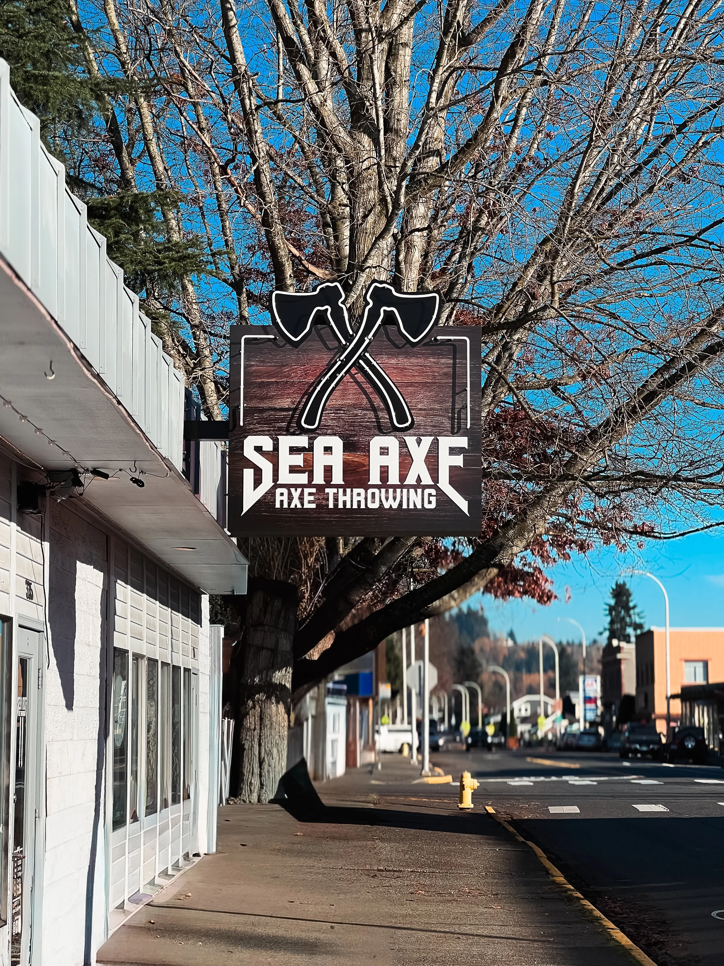
Sea Axe Axe Throwing in Auburn is an axe-throwing venue centered on high-energy, social entertainment.
A 4.5’ × 4.5’ double-sided, roof-mounted blade sign serves as the primary exterior marker. Fabricated in aluminum with a satin black finish, the sign incorporates internal LED illumination, neon accents, a printed wood-texture panel, and push-through acrylic lettering. The installation establishes a bold rooftop identity aligned with the venue’s character.
Sharp’s Roasthouse - “Moose Juice”
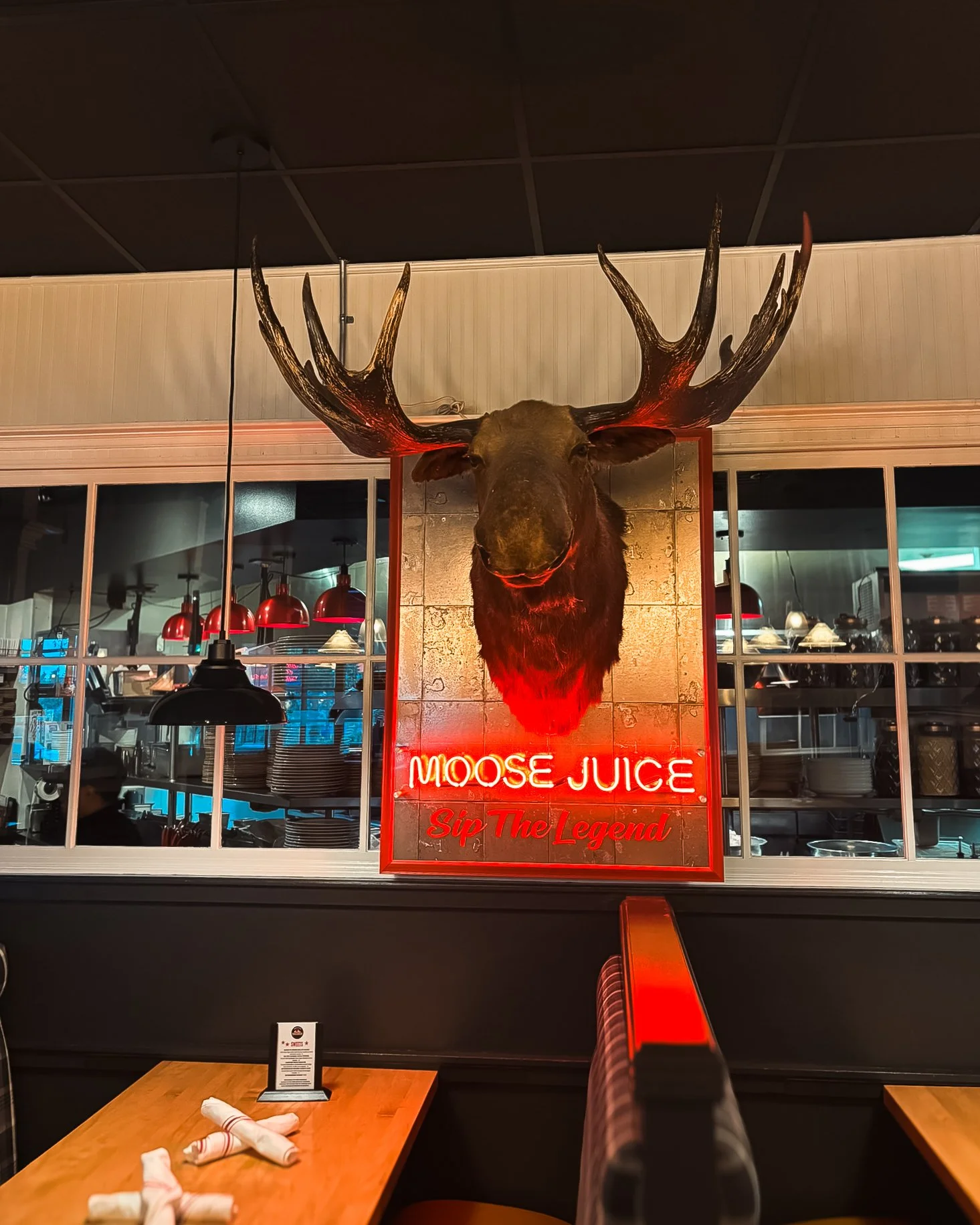
Sharp’s Roasthouse is a Seattle restaurant and bar known for its pub-style menu and casual energy.
This project builds on an existing mounted moose head display, adding a compact 6” × 33” neon “Moose Juice” sign integrated directly onto the panel. The sign uses 12mm clear red neon with a polycarbonate face. Red vinyl lettering on the backing panel visually connects the neon to the display without overpowering it.
It’s a small addition that adds character and fits seamlessly into the restaurant’s existing visual language.
South End Ceramics
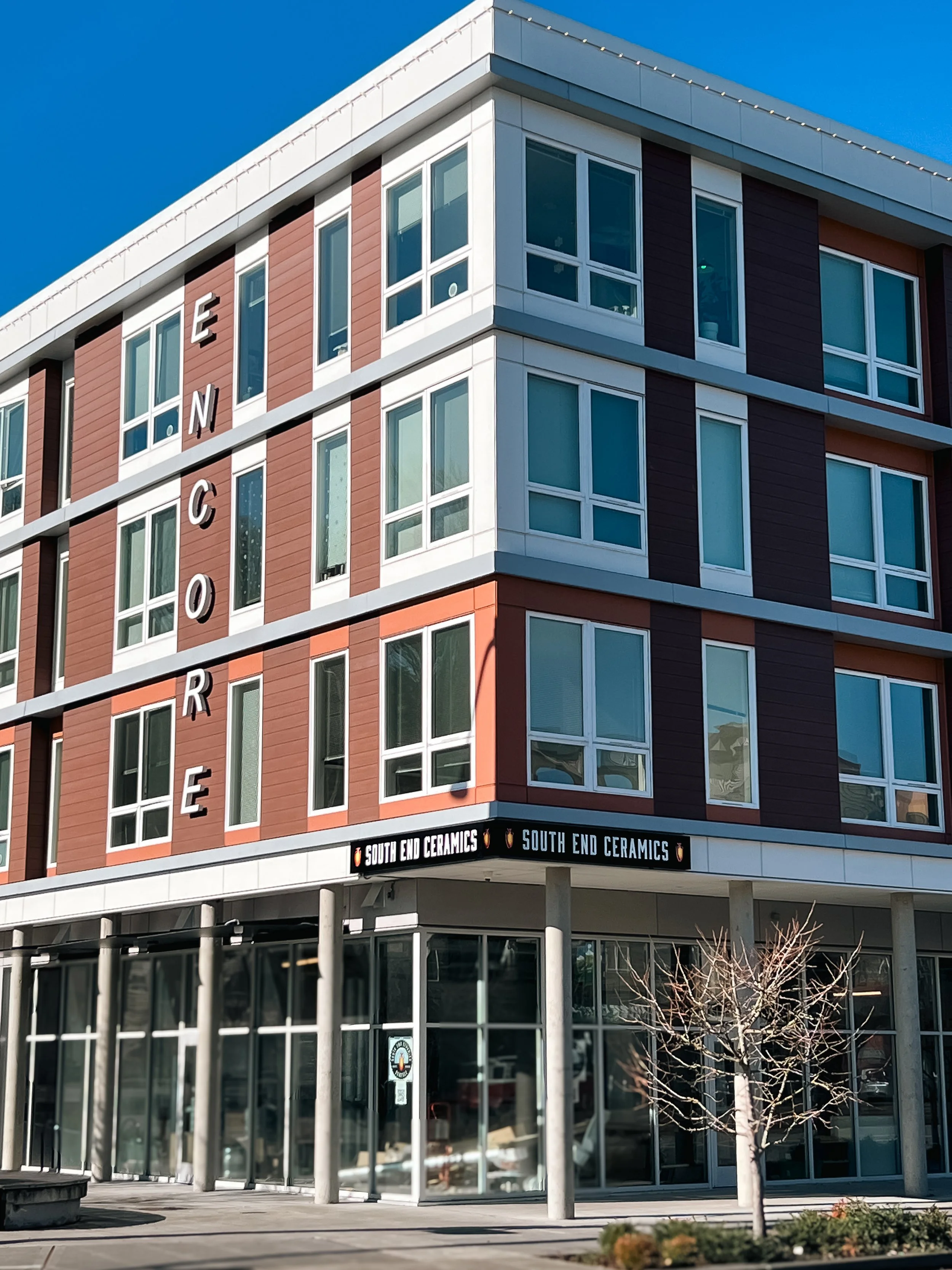
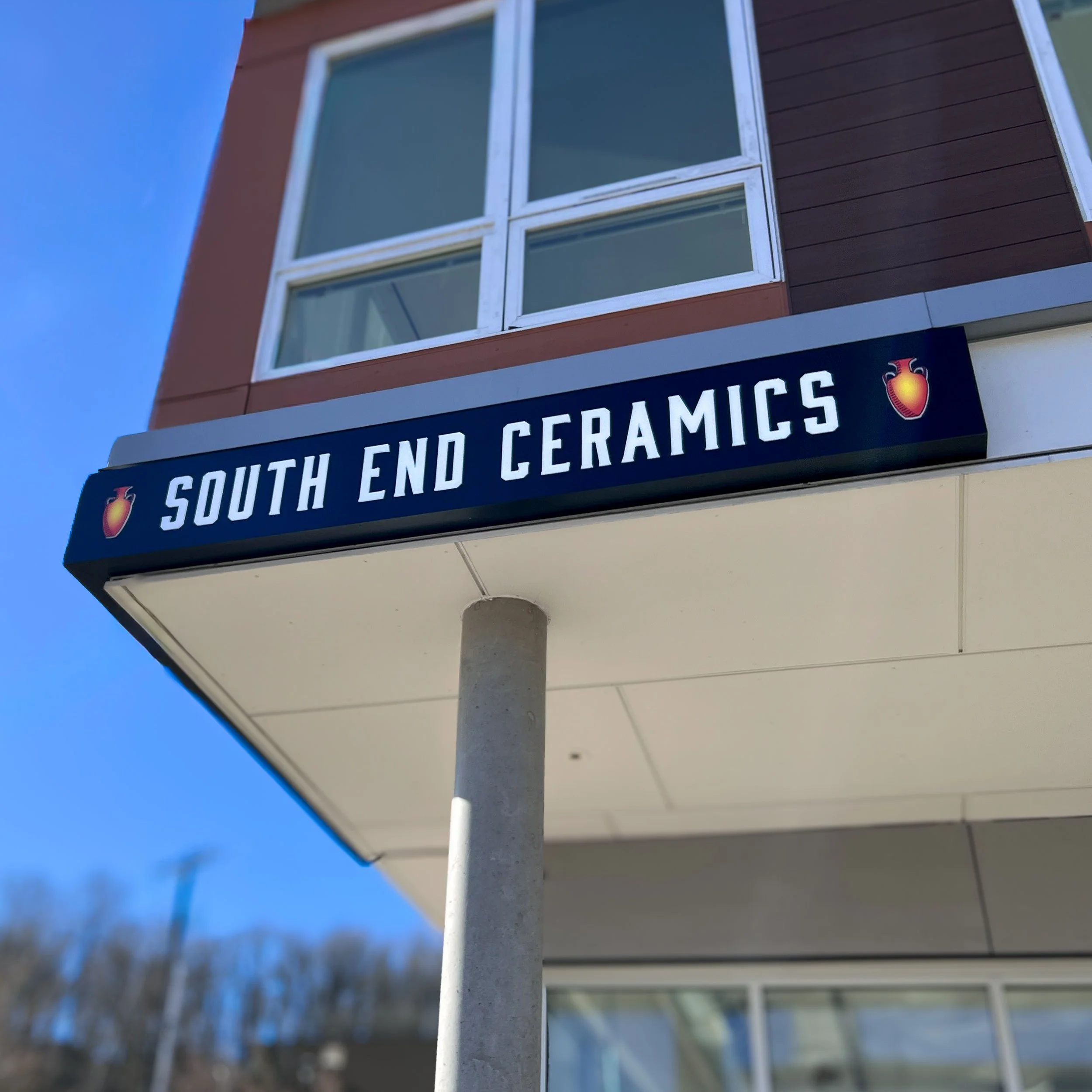
South End Ceramics is a Seattle studio and community workspace focused on handcrafted pottery and education.
Two 10’ × 1’ exterior wall signs form the core installation. Fabricated in aluminum with a matte black finish, each sign uses routed copy with acrylic push-through lettering and printed graphic elements, illuminated by 6500K LEDs for a crisp look.
The system maintains a minimal, architectural presence aligned with the studio’s material-driven environment.
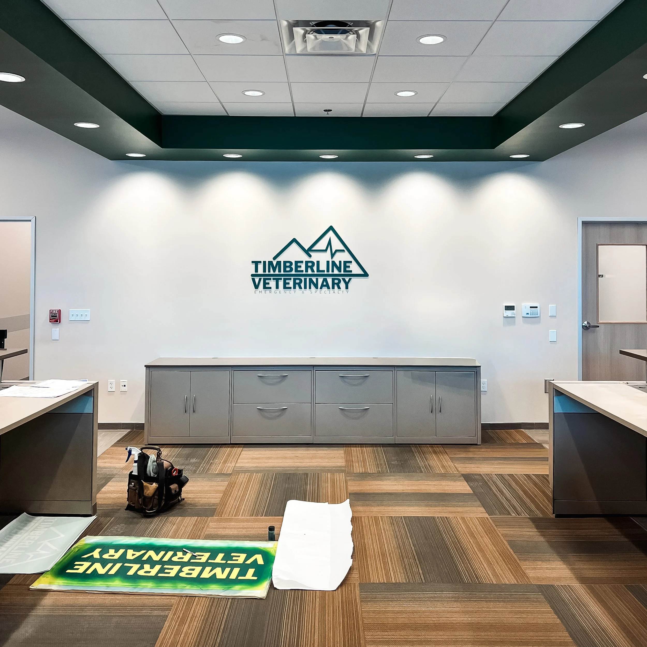
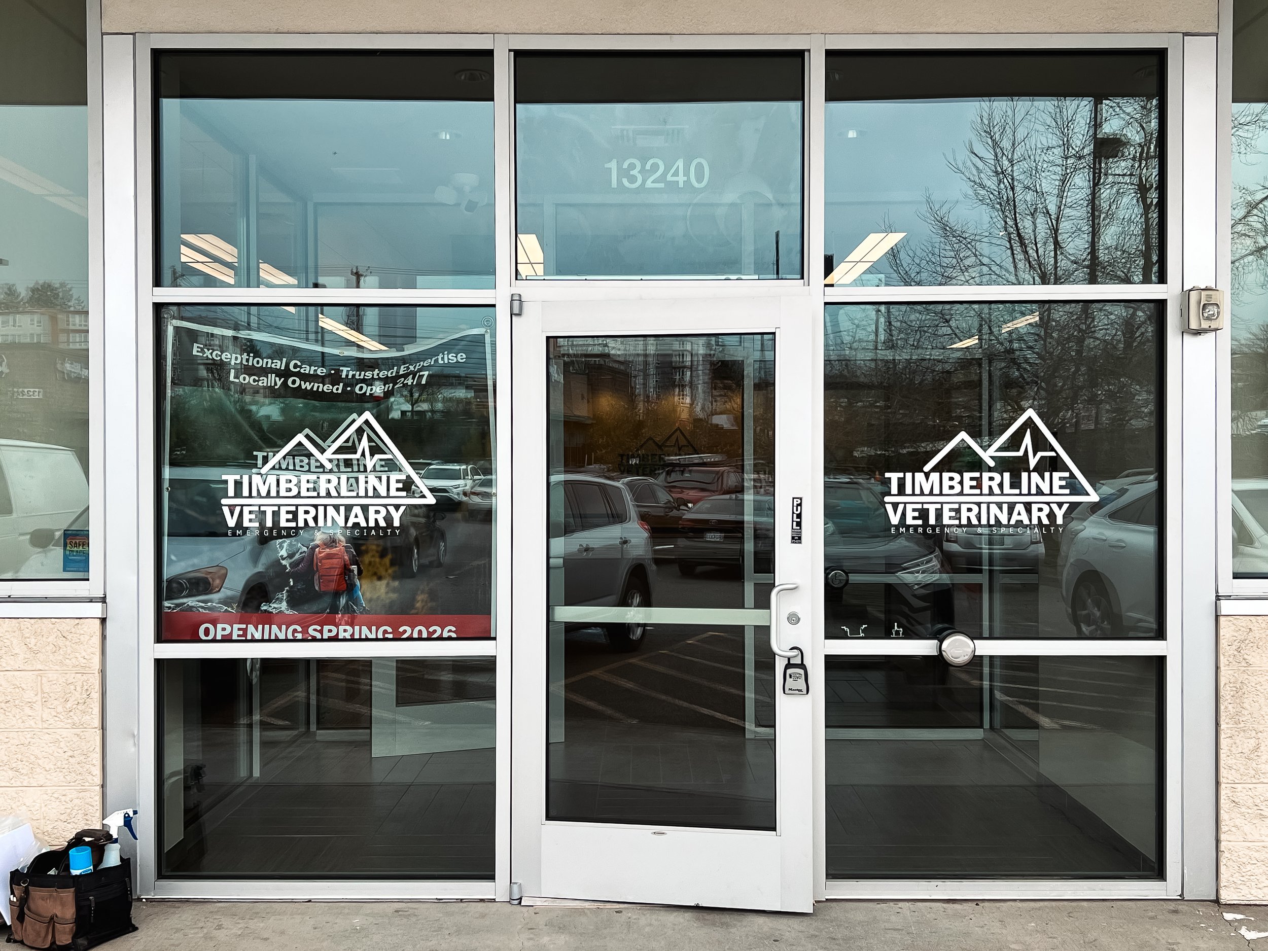
Timberline Veterinary
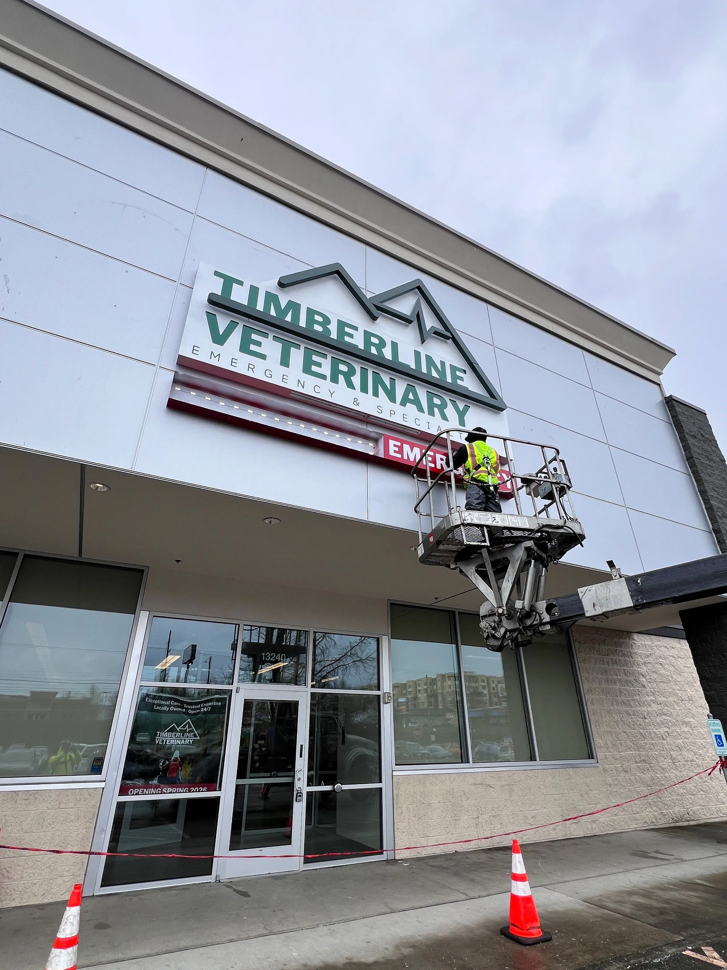
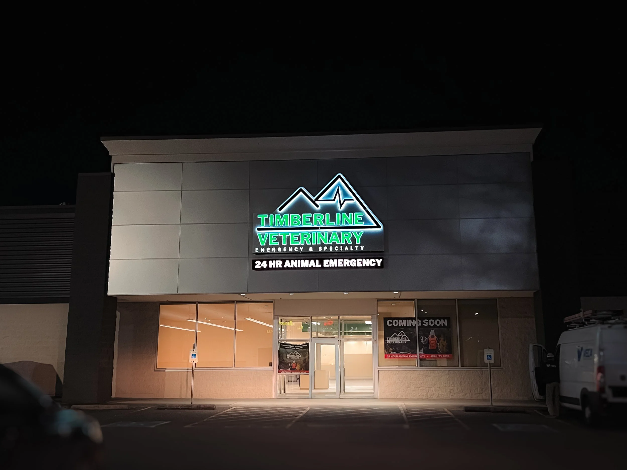
Timberline Veterinary Hospital in Aurora is a full-service clinic dedicated to compassionate companion animal care.
An illuminated cabinet sign mounted to the building features white acrylic push-through lettering with green detailing. A halo-lit logo adds depth and a softer glow, giving the sign presence without feeling overly bright.
At the entry points, digitally printed vinyl door graphics extend the branding onto the glass, creating a consistent experience from the moment clients arrive. Inside, a lobby wall sign combines flat-cut acrylic lettering in a satin green finish with applied vinyl text, mounted flush to the wall for a clean, modern look.
Town & Country – Poulsbo
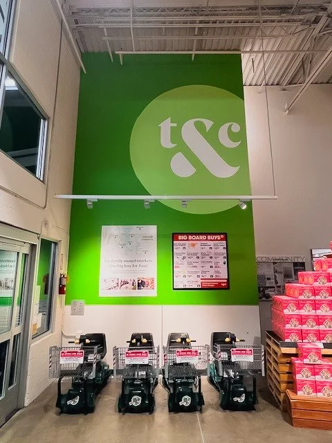
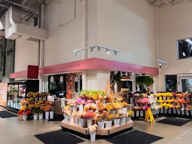
Town & Country Market in Poulsbo included a wide-ranging interior signage package designed to support multiple departments throughout the store.
Select elements include a painted primary entry wall, fascia signage in the Flower & Garden and Community Kitchen areas, along with hanging and blade signs that help guide customers through the space. A deli board–style hanging sign stands out, introducing a more tactile, crafted feel using natural wood materials and painted graphics.
Additional details like acrylic lettering, wall graphics, and mesh banners carry the branding across different zones, creating a consistent experience while still allowing each department to feel distinct.
No two projects are the same, but the approach stays consistent: thoughtful design, durable materials, and signage that feels like it belongs.
Western Neon creates custom signage, interiors, and public art. With over 35 years of experience, we make your vision a success from the first idea to the finishing touch. Start a project today!