
April 2024 Project of The Month: The Fantastic Four

Imagine stepping into a workspace buzzing with creativity and ambition, where the usual accolade of "Project of the Month" has been transformed into an unprecedented celebration of innovation. This month, instead of highlighting just one standout project, we are showcasing four distinct ventures, each brimming with unique ideas and breakthrough potential. This expansion from a single project to four is not merely a quantitative increase, but a qualitative leap that reflects our community's diverse talents and relentless drive. By recognizing a quartet of projects, we embrace a broader spectrum of ingenuity, from technological advancements to social initiatives, each one paving the way for new methods, solutions, and collaborations. This approach not only multiplies the recognition but also fosters a spirit of healthy competition and mutual inspiration among our teams. What is better than one project of the month? The thrilling possibility and promise held in celebrating four.
SODO Business Improvement Area

The creation of the SODO Business Improvement Area (BIA) sign is not just a testament to modern design and engineering but also serves as a transformative element within the interior working environment it adorns. Crafted with meticulous attention to detail, the sign is a harmonious blend of form and function, encapsulating the vibrant spirit of the SODO BIA while enhancing the ambiance of its surroundings.
At its core, the sign features a 2-inch deep fabricated aluminum cabinet, painted in a crisp white to serve as a neutral canvas for the burst of colors it houses. This cabinet not only secures the power supplies and wiring but also mounts flush to the wall, ensuring a sleek and unobtrusive integration into any interior space. The use of keyhole slots for mounting allows for a seamless installation, preserving the aesthetic integrity of the environment.

The textual elements of the sign, comprising "SODO" and "BUSINESS IMPROVEMENT AREA," are rendered in a variety of warm and inviting colors. The "SODO" text employs a palette of warm red, primrose yellow, peacock blue, and apple green vinyl, applied directly to the sign face. These colors are not just visually striking but also evoke a sense of creativity and energy, contributing to an inspiring and motivating atmosphere. The addition of neon lighting, with tubing in complementary colors, adds a dynamic and modern twist, illuminating the space with a soft, ambient glow that enhances the overall mood and productivity of the working environment.
Furthermore, the sign's design includes practical features such as eyehooks for optional hanging and a standard black cord with a rocker power switch, ensuring ease of use and versatility in various interior settings. The thoughtful integration of these elements means that the SODO BIA sign is not merely a marker of location but a pivotal component in crafting an engaging, stimulating, and cohesive interior work environment.
Nancy Fritz Designs

The creation of the sign for Nancy Fritz Designs is a testament to the convergence of innovative design and aesthetic sensibility, manifesting not just as a brand identifier but as an art piece that enriches the visual landscape of its surroundings. Mounted in a distinctive location above the front door of the establishment, the sign features an intricately designed blue neon tree, symbolizing growth, creativity, and the natural evolution of ideas—core principles that Nancy Fritz Designs stands by.
This masterpiece utilizes 10mm Ablon sky blue neon to craft the "tree," a choice that imbues the piece with a sense of tranquility and boundless imagination, akin to the serene expanse of the sky. The decision to mount this visual spectacle on the exterior wall, right above the entrance, is strategic, transforming the entryway into a portal that not only welcomes visitors but also immerses them in the creative ethos of Nancy Fritz Designs from the first glance. The glass supports, painted black to contrast with the vibrancy of the neon, along with the black hardware, ensure that the focus remains on the luminous beauty of the tree, making it a beacon of creativity that captures the attention of passersby.

The choice of white neon for the text is deliberate, offering a stark, luminous contrast to the sky blue of the tree, ensuring that the name of the establishment is legible from a distance while harmonizing with the overall design. The same meticulous attention to detail is applied to the mounting of the lettering, with glass supports painted black to maintain aesthetic consistency and coherence.
The sign's unique placement and design do more than merely signal the location of Nancy Fritz Designs; they embody the establishment's commitment to innovation, beauty, and the transformative power of design. As an art piece, the sign elevates the exterior environment, turning the facade into a canvas that communicates the firm's identity and values. This strategic integration of branding and artistry not only enhances the street's visual appeal but also sets a precedent for creative expression in commercial signage.
Shine On You Crazy Diamond
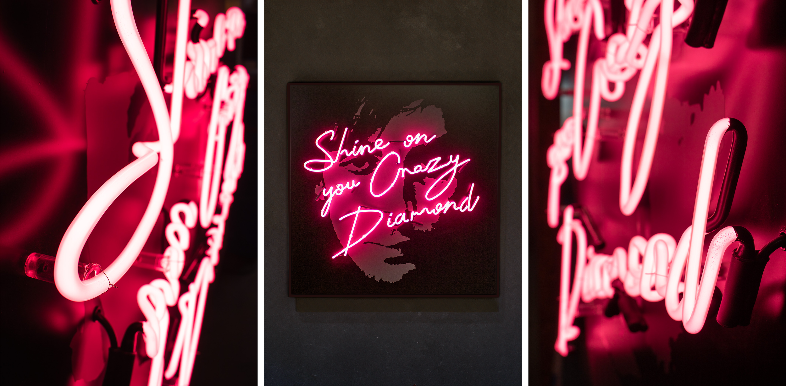
The creation of the "Shine On You Crazy Diamond" sign is a magnificent ode to one of Pink Floyd's most iconic songs, reimagined as a mesmerizing art piece within a private home. This isn't just a sign; it's a tribute, encapsulating the spirit of the song and the band's legacy through its thoughtful design and atmospheric presence. The technical craftsmanship behind this piece is as intricate as the musical composition it celebrates, making it a centerpiece that elevates the aesthetic and emotional tone of its surroundings.
Constructed from a fabricated aluminum sign cabinet, painted in a deep, satin black, the sign serves as a sophisticated frame for the vibrant heart on top. The cabinet is designed to house neon transformers and wiring discreetly, ensuring a seamless blend with the home's interior while mounted flush to the wall using mechanical fasteners.
Illuminating the sign, and indeed the room it adorns, is the phrase “Shine On You Crazy Diamond” rendered in 10mm Bubblegum pink neon tubing. This choice of color is not just an aesthetic decision but a symbolic one, resonating with the vivid imagery and emotional depth of Pink Floyd's music. The neon tubing is supported by black acrylic tube supports, with any supports located on the grey vinyl graphic painted to match, ensuring visual continuity and drawing the viewer's gaze to the luminous text.
In the context of a home, this sign transcends its function as a mere decorative piece, becoming a focal point that embodies both personal and universal themes of nostalgia, inspiration, and artistic appreciation. It stands as a testament to the enduring influence of Pink Floyd, bridging the gap between music and visual art, and inviting contemplation and conversation. This sign is not just seen; it is experienced, shining on as a perpetual reminder of the band's luminous legacy within the intimate spaces of daily life.
La Dive, Queen Anne

The sign for La Dive in Queen Anne is a masterstroke of urban design that not only marks the presence of the establishment but also significantly contributes to the lively ambiance of the area. Crafted with precision, the sign consists of 1/4” thick flat cut aluminum letters, painted in a serene Minton Green. This choice of color does not just capture the eye but also harmonizes with the surrounding environment, infusing it with a fresh, inviting aura.
Mounted to the wall with 1/2” standoffs, the letters of the sign project outwards, creating a subtle but impactful 3D effect. This method of mounting, combined with a minimum 1" embedment into the wall and the use of silicone adhesive, ensures durability against the elements while maintaining an aesthetic alignment with the urban landscape. The careful attention to the quantity of support per letter guarantees that each character stands out with clarity and stability.
A striking feature of the sign is the lighting bolt, crafted from 10mm emerald coated neon, bringing a dynamic energy to the sign and the street it overlooks. Mounted on glass supports, which are attached to the wall with screws into plastic anchors, the neon bolt is an electrifying visual cue that draws attention not just to La Dive but also adds to the nighttime vibrancy of Queen Anne. The supports are painted to match the wall color, creating a cohesive and aesthetically pleasing look when viewed from a side angle.
This sign does more than announce the presence of La Dive; it enhances the streetscape, contributing to the area's identity and vitality. The thoughtful design and placement of the sign, with its harmonious color scheme and dynamic lighting, enrich the urban fabric of Queen Anne, making it a landmark not only for locals but also for visitors, thereby elevating the overall experience of the lively street environment around it.
Western Neon creates custom signage, interiors, and public art. With over 35 years of experience, we make your vision a success from the first idea to the finishing touch. Start a project today!